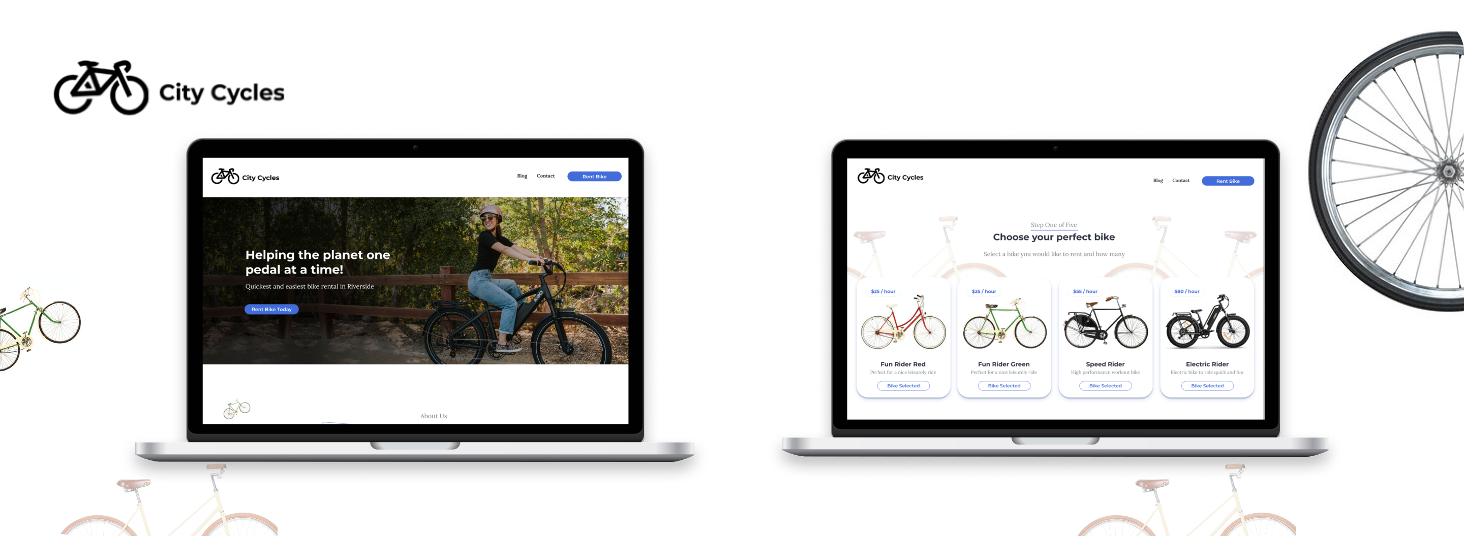
Project overview
Project Details
Scope - Fix the design of the website and the user flow of users renting bikes on their website.
Problem - Users are not using the website to rent bike because of confusing navigation and only able to rent bike by email.
Type - Portfolio Project
Duration - 1 week
From research to final design
My Role
-
 User Research and User Interviews
-
 Analyze User Research Data
-
 Sitemaps and User Journey Maps
-
 Wireframes and Prototypes
-
 Usability Study
-
 Design Iterations
-
 Hi-Fidelity Design
Qualitative data
User Interviews
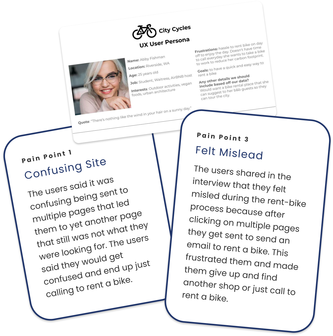
I conducted moderated user interviews to collect qualitative data to better understand the user’s needs and pain points.
The goal of the interviews:
- learn what motivates the user
- how often they rent bikes
- their experience using the current website
After the interviews:
- analyzed the data
- create user personas to help empathize with users
- understand user pain points
Quantitative data
Google Analytics Data
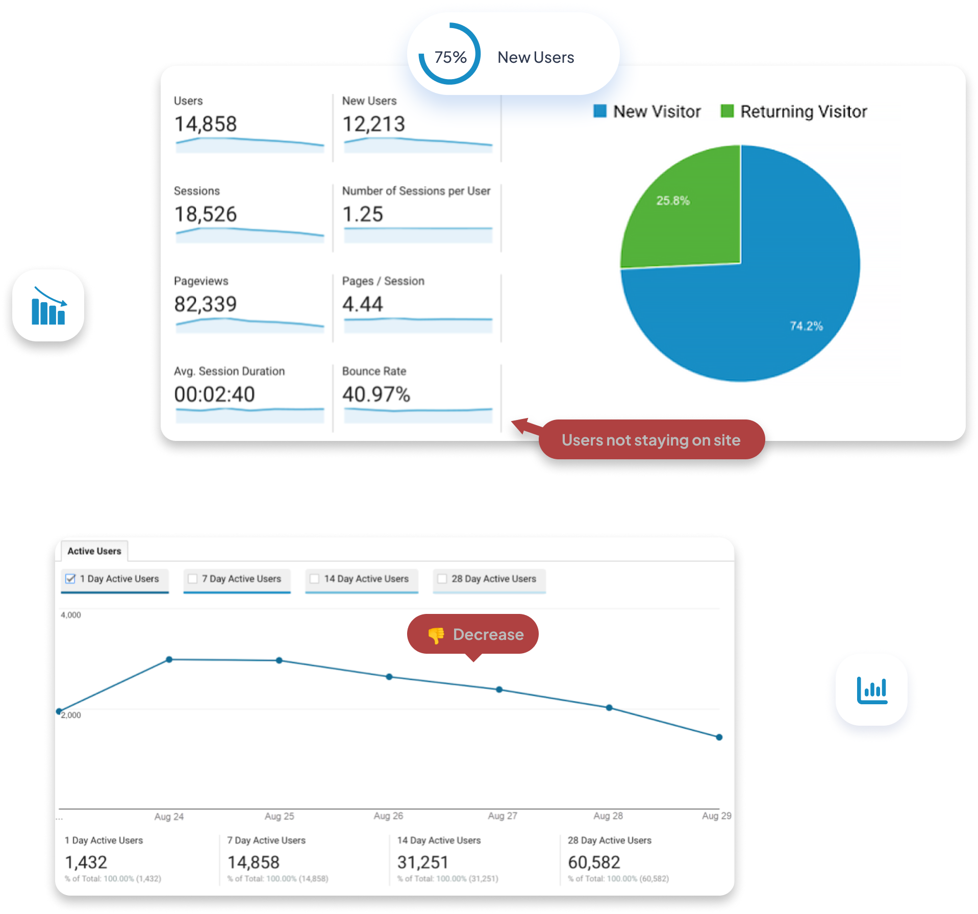
The quantitative data was collected to see the number of users that were visiting the City Cycles website and the percentage of repeat visitors and new users.
Analysis of pie chart showed:
- 75% of users are new
- 25% are repeat users
- bounce rate 40.97%
Pie graph shows there is a problem with usability if users are not coming back to the website shown by repeat users.
The bounce rate at 40% is also showing us users are not staying on page to complete the bike rental process.
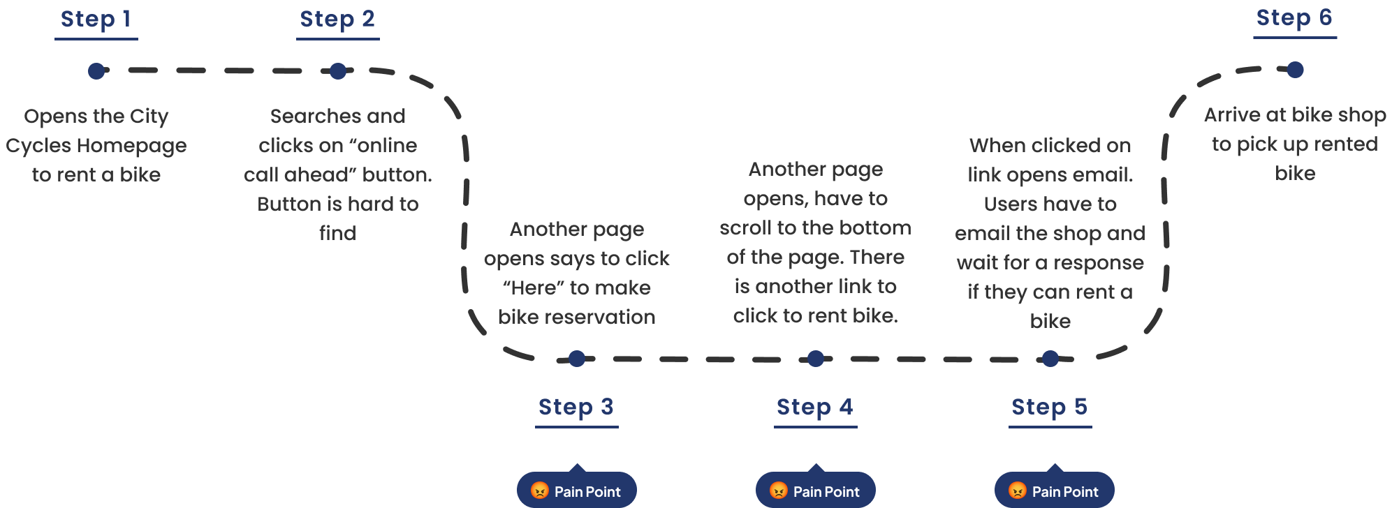
Current website user journey
User Journey Map
This is the user journey map of the current website so I can see what parts of the website need to be changed in order to create a better user experience.
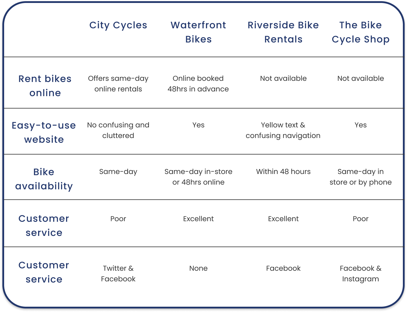
Finding areas of opportunity and inspiration
Competitive Analysis
The competitive analysis showed areas of opportunity to create a streamlined user journey when renting bikes.
Seeing what the competition is doing well helped with inspiration when creating the bike rental journey for my client.
Taking the time to complete competitive audits saves time and money down the line when I start to design the solutions resulting in less iterations.
Research presentation
Data Visualization
I compiled my research into a presentation to sum up my findings.
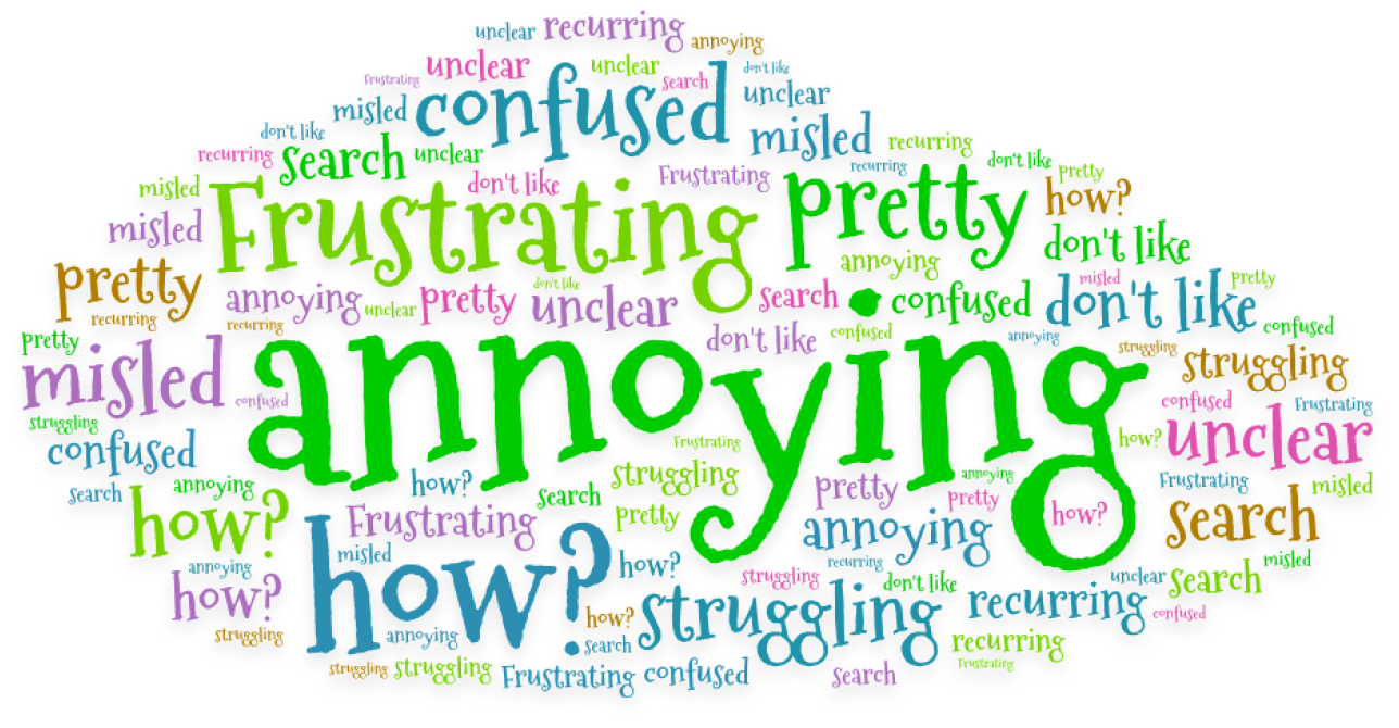
I included qualitative and quantitative data with graphs from Google Analytics, user personas, and a word cloud.
This presentation is helpful to the client and stakeholder to explain visually the discoveries from the research.
IA model
Information architecture
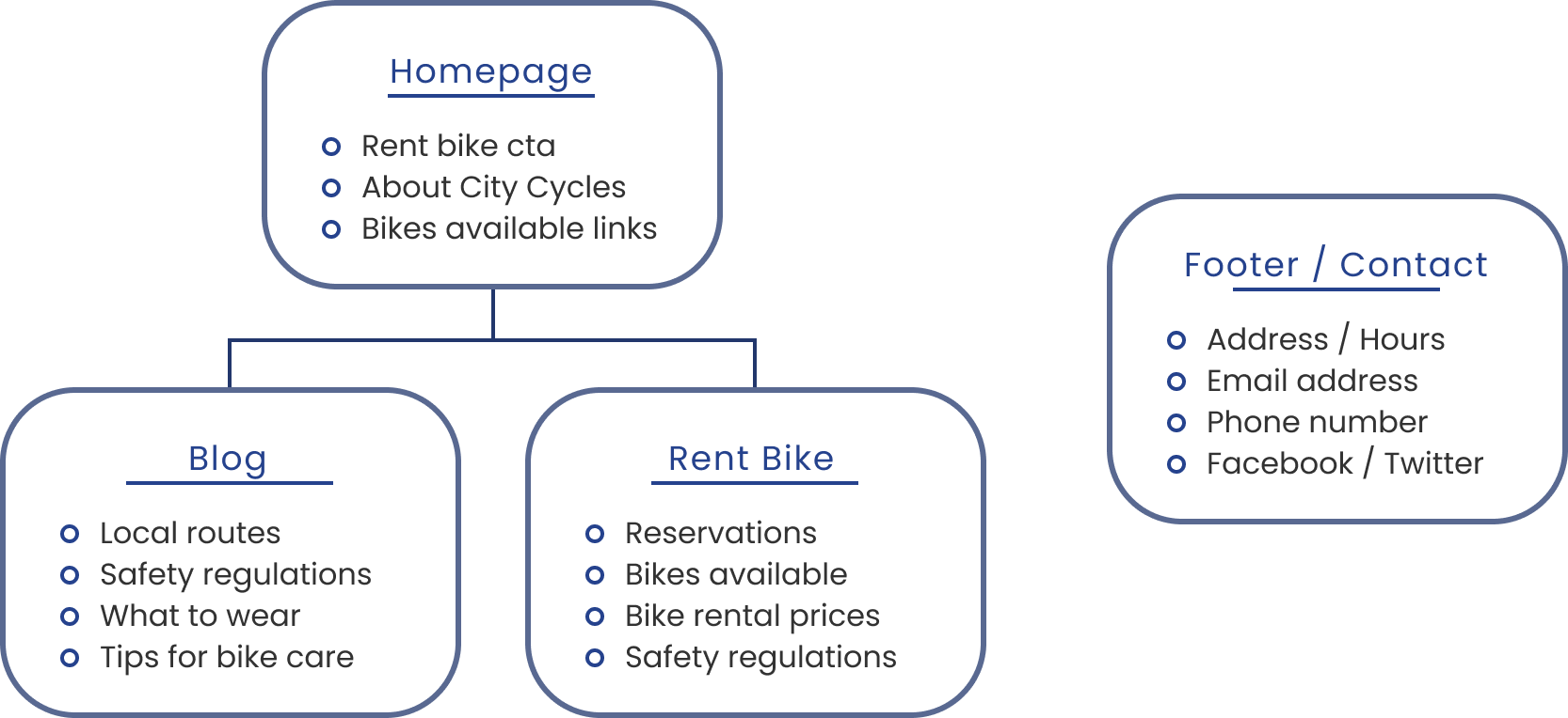
I decided to using a hierarchical IA model because I wanted to have the homepage as the main page with links to all the other pages the user would need. A hierarchical model allows users to access any other page, no matter where they currently are addressing one of the user pain points of the website being confusing.
Visualizing the layout
Site Map
My goal in creating the sitemap is to create a better user experience making sure the information the users were looking for was easy to find.
These changes solved the main pain point users expressed during the user research about being sent to multiple pages just to rent a bike.
Redesign user flow
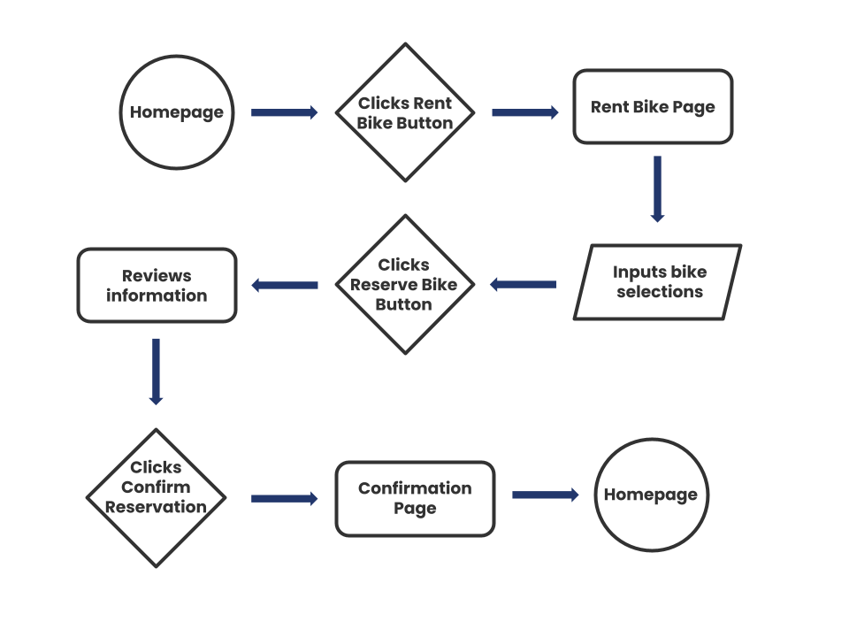
User Flow
The users were very clear that it is frustrating and annoying to be taken to so many pages to just end up having to send an email to rent a bike.
Goals of the user flow:
- create seamless user experience
- limit the amount of pages to rent bikes
- make a page to rent bike instead of only email
In order to ensure I address the user's concerns and frustrations I compared my user flow to the user journey map I created earlier in the research.
Paper wireframes
Wireframes
Paper wireframes helped me to get my ideas down quickly and start to brainstorm solutions. I created a couple of designs for all pages taking all of those and combining them together to create a final paper wireframe design for each page.
Adding detail to the design
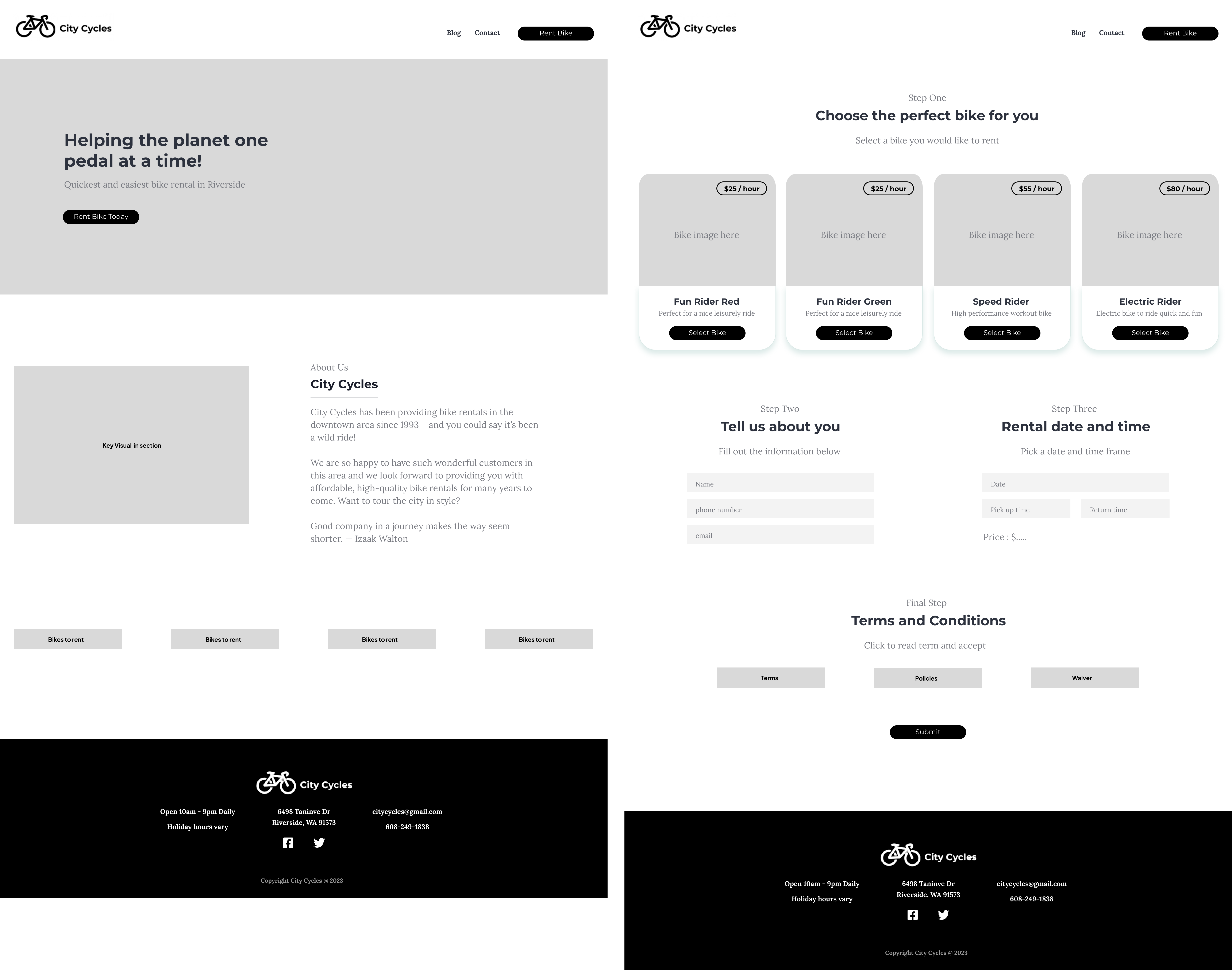
Low-Fidelity Wireframe

Finalizing details to the design
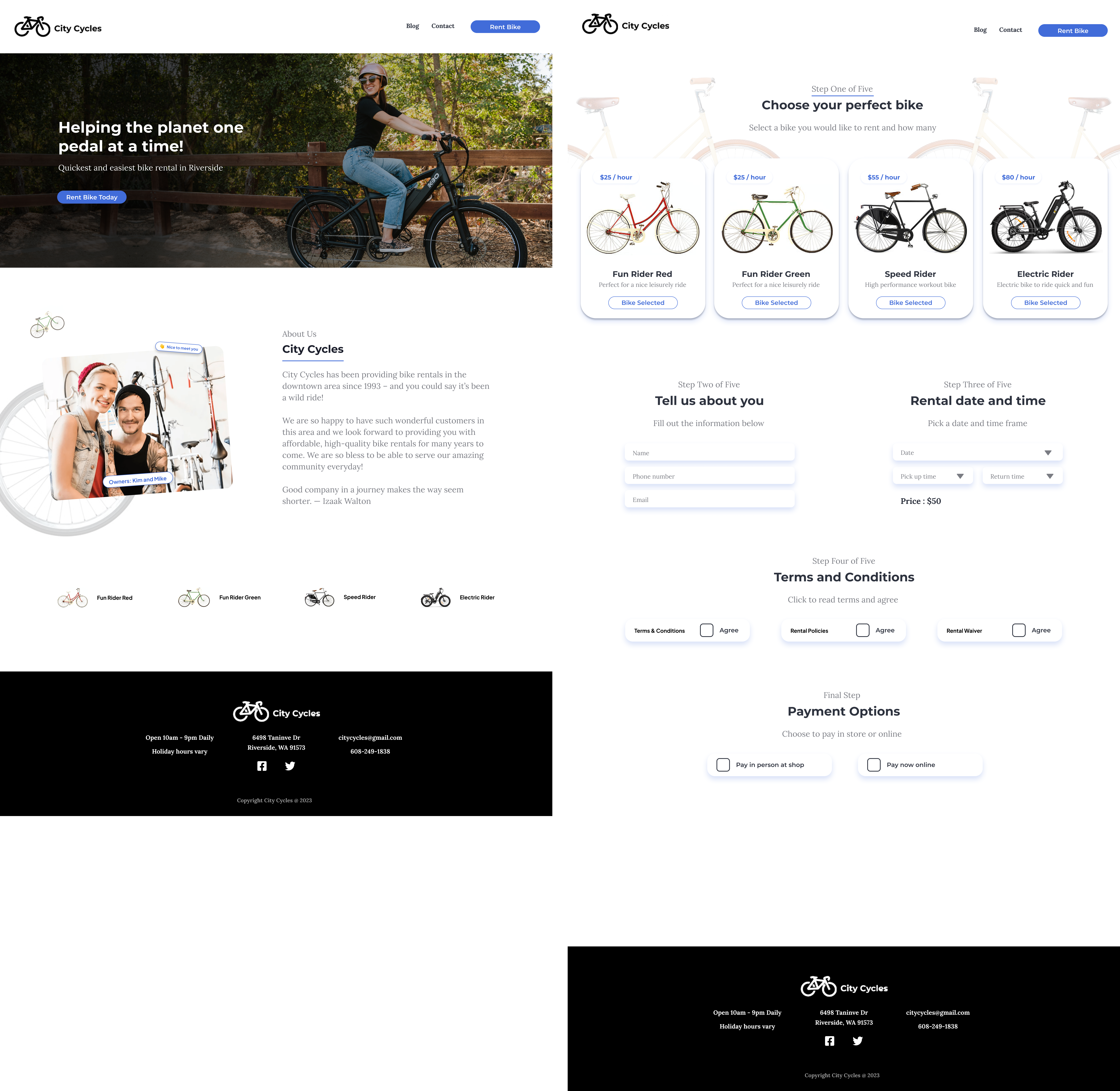
High-Fidelity Design

Prototype ready for user testing
High-Fidelity Prototype
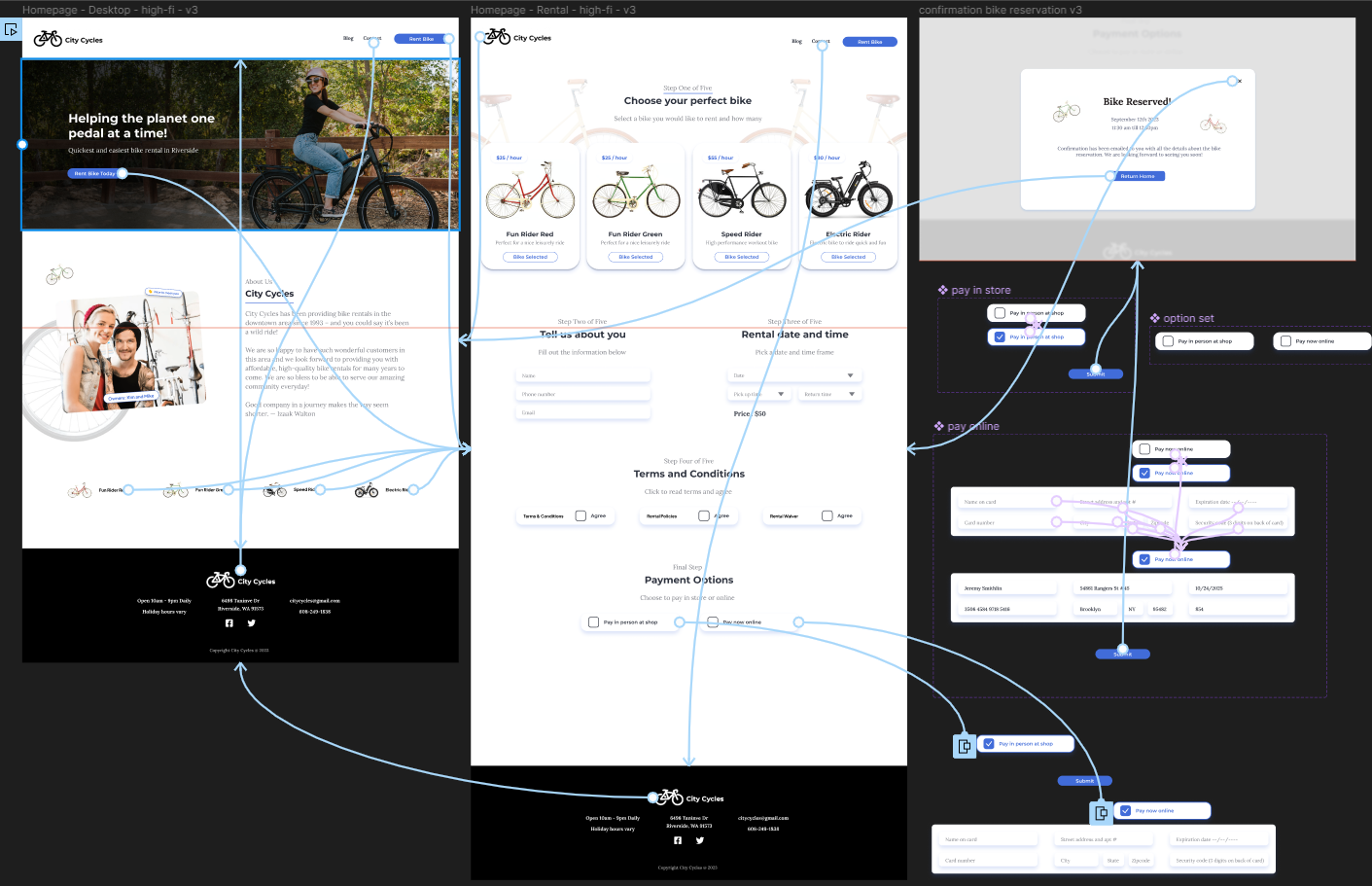
They already had a design system that they wanted to keep with the new design. So I made sure all the images, colors, and fonts stayed within their current design system.
I created the prototype linking the pages and elements together in order to go through the user journey and test the user flow.
The goal of the prototype was to have it function just like the final product will to get better feedback during the user testing.
Testing with users
Usability Testing
During my initial tests, I came across problems with the payment options radio buttons not working properly and learned how to create overlays of the design in order to fix the problem.
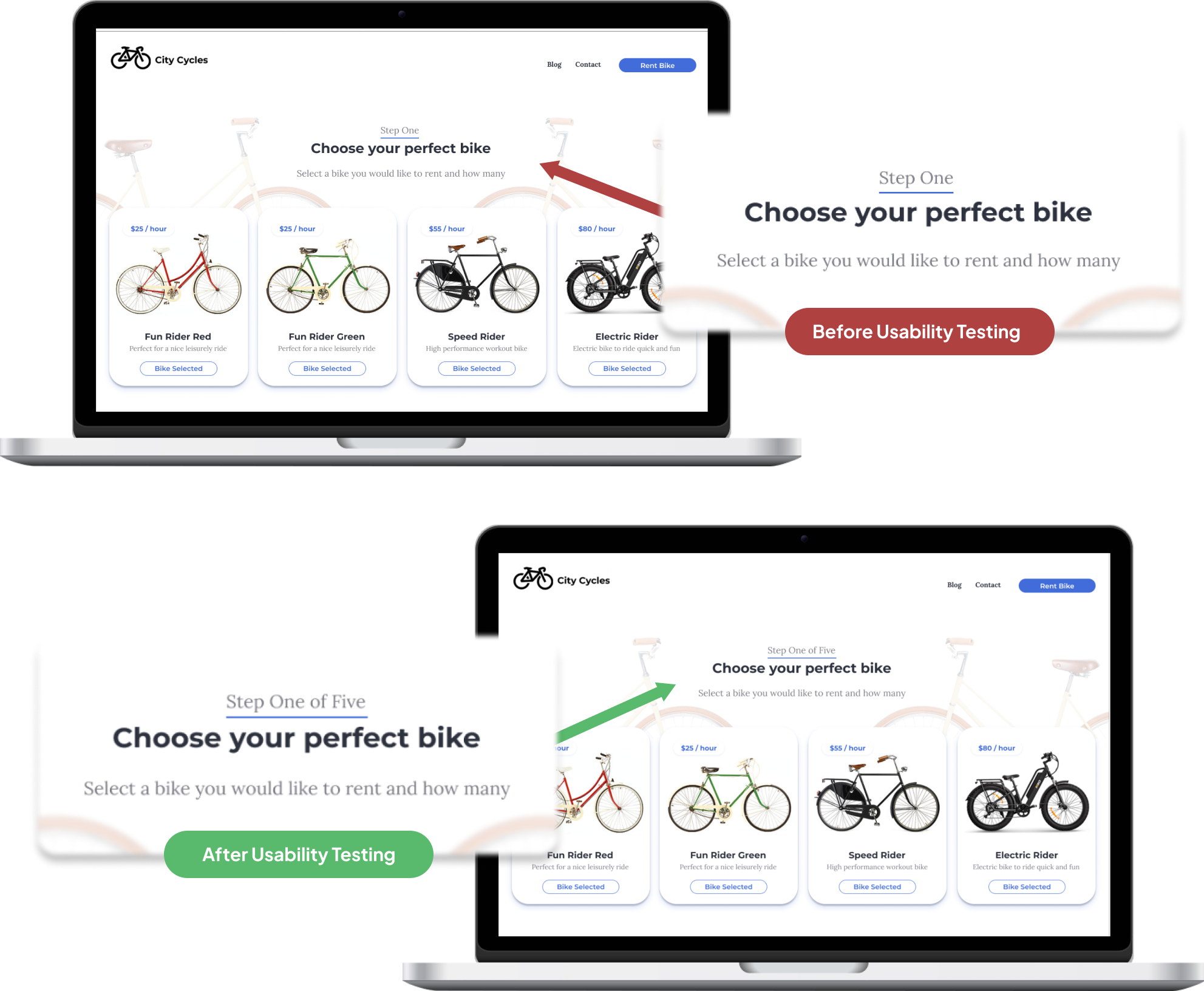
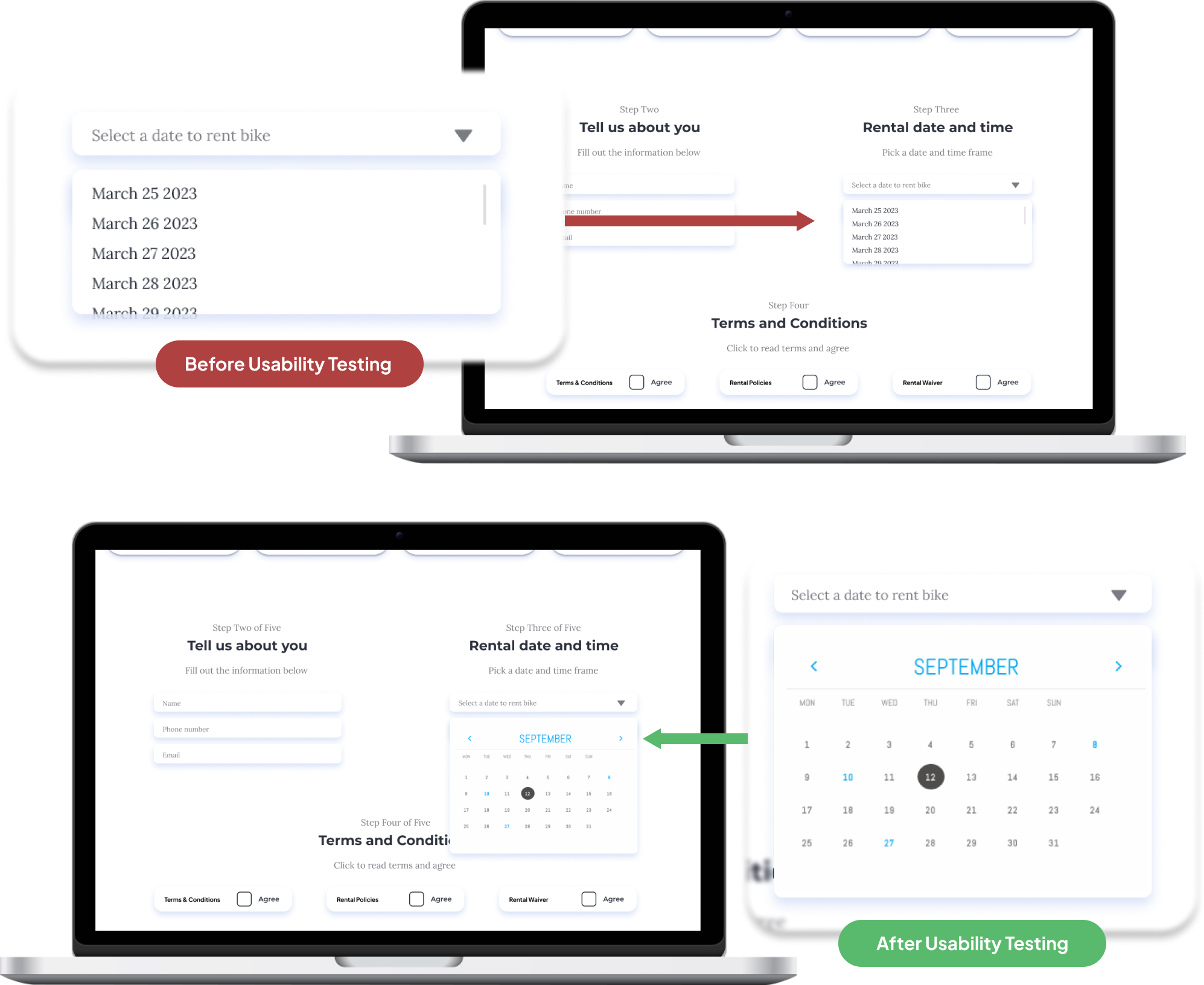
Conducting the usability tests with users I found 2 areas the users struggled:
- users would like to know how many steps to complete the process instead of just the step they are on
- users did not like the list to pick a date but would rather have a calendar to pick the date
User steps
Iterations
The usability test showed me that users would prefer if the number of steps was listed instead of just the number they were on.
Comments from the users:
- they are less likely to complete a process if they do not know how long it will take
- users said they like seeing when they are almost done with a process
Date Picker
Iteration
The users also expressed that when they were trying to pick a date they had to think about what the date was because they knew the day like Monday but had to look up what date that would be.
Comments from the users:
- Users expressed frustration having it in a list because they do not always know the date but they know it is this Monday for example
- Users said with the list they would still rent the bike this time but might not return to rent another bike
Old vs new design
The Results
Throughout the usability testing process after the iterations, all the users went through the process with ease and did not get stuck at any point. This showed me that no further testing was needed to meet the client's needs and it addressed all of the user pain points that were discovered during the user research.


Learned From This Project
Takeaways
I learned more about user interactions with prototyping in Figma. Learning how to create radio button interactions and overlays for the payment section was great and I am so excited to use that knowledge in future projects.
Thank You!
Thank you so much for your time going through this project with me. I had so much fun creating and learning from this project. I am so excited for the next project to continue to grow as a designer.
