Project overview
Project Details
Scope - Create a one page responsive website to display chairs available to purchase.
Problem - The client is ready to launch her site to showcase her chairs and she needs a design that she can give to her developer
Type - Portfolio Project
Duration - 2 Days
Specified must be included
Client Brief
-
 A large header (CTA) with images and text encouraging
customers to pre-order
-
 A Pre-order section with chair photos, product names, and
links to pre-order
-
 About section with information on the company and its
mission including a photo
-
 Contact section in the footer with links to social media,
email address, and phone number
-
 Navigation with links to the Pre-order, About, and Contact
sections
Client deliverables
My Role
-
 Mobile, tablet, and desktop design comps
-
 Design brand inspired by their logo and mission
-
 Exported assets to handoff to their web developer
Client would like landing page to convey
Client Project Goals
-
 Showcase her chairs and entice pre-orders
-
 Highlight mission as a fair trade and fair labor designer
-
 Visually communicate her personality and mission
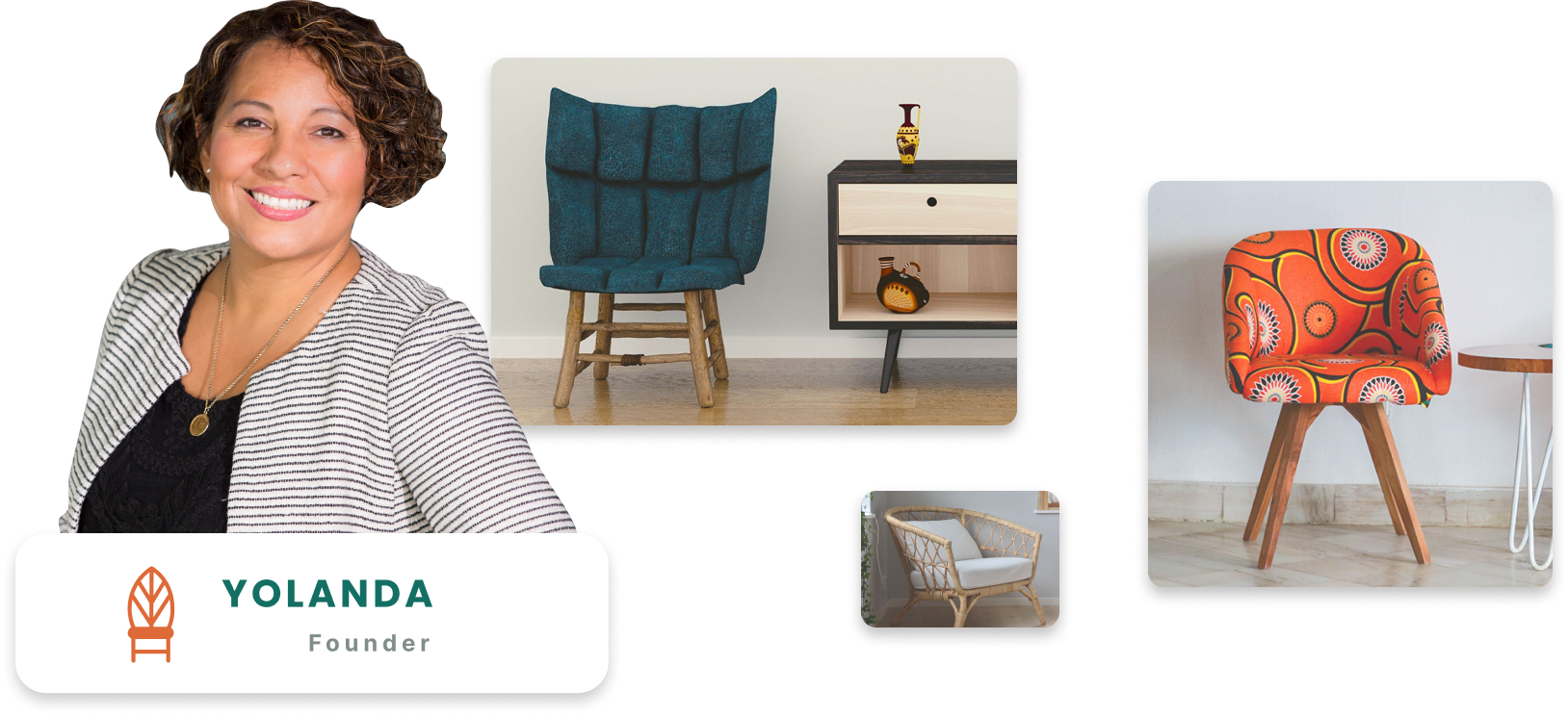
 Sit Conmigo's mission is to create chairs that are
trendy, stylish, and best of all, comfy! Every Sit Conmigo chair
is made with only sustainable, fair-trade materials.
 We’re also
committed to promoting fair labor practices that
ensure our employees have safe working conditions and are paid
fairly for their skills. The result is a chair that you’ll not
only love in your home or office but also a chair that was
lovingly made by the person building it.
User research & competitive analysis
User Research
The client already conducted user research and included that in the client brief. I analyzed the information provided to understand not only what the client was looking for but also what the users were looking for.
The client researched her competitors and noticed many of her competitors are big-box retailers who often focus on either sustainably sourced materials or fair labor. She is very proud of her business and wants to make sure that her mission is shared with the world.
User research was not part of the scope of the product but I made sure to read through all the information and understand not only what was best for the client but also the users.
Design the solution
Paper Wireframes
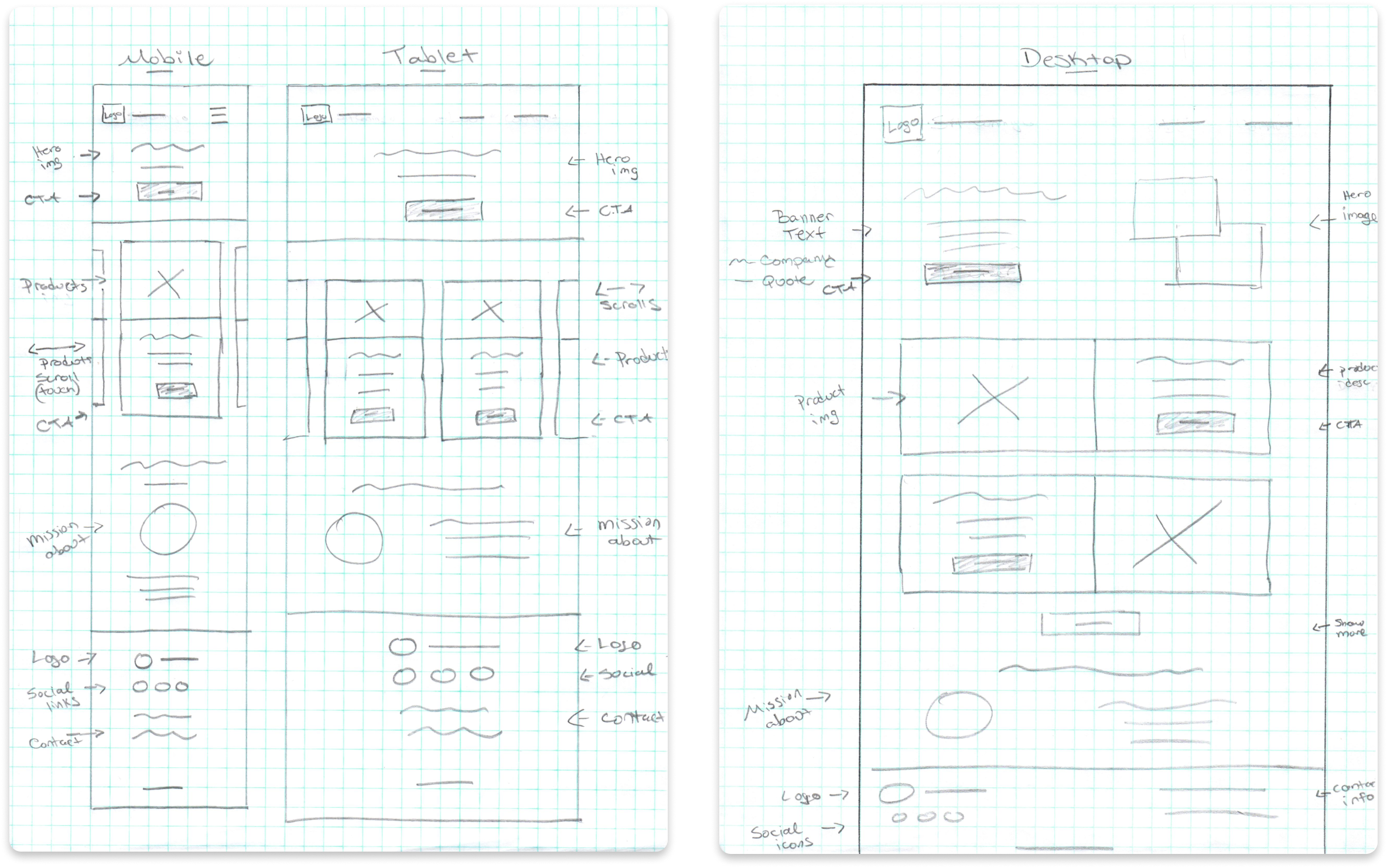
I started by creating very quick sketches called crazy eight’s using the mobile-first approach. Doing these quick sketches helped me get ideas down quickly and helped me to visualize the design.
After running through a couple of iterations of the designs for each screen size I created final paper designs. The designs shown here are the final paper wireframe designs I created for each screen size. Each design I create includes notations in the margins to help me stay organized throughout the process.

Adding detail to the design
Low-Fidelity Wireframe
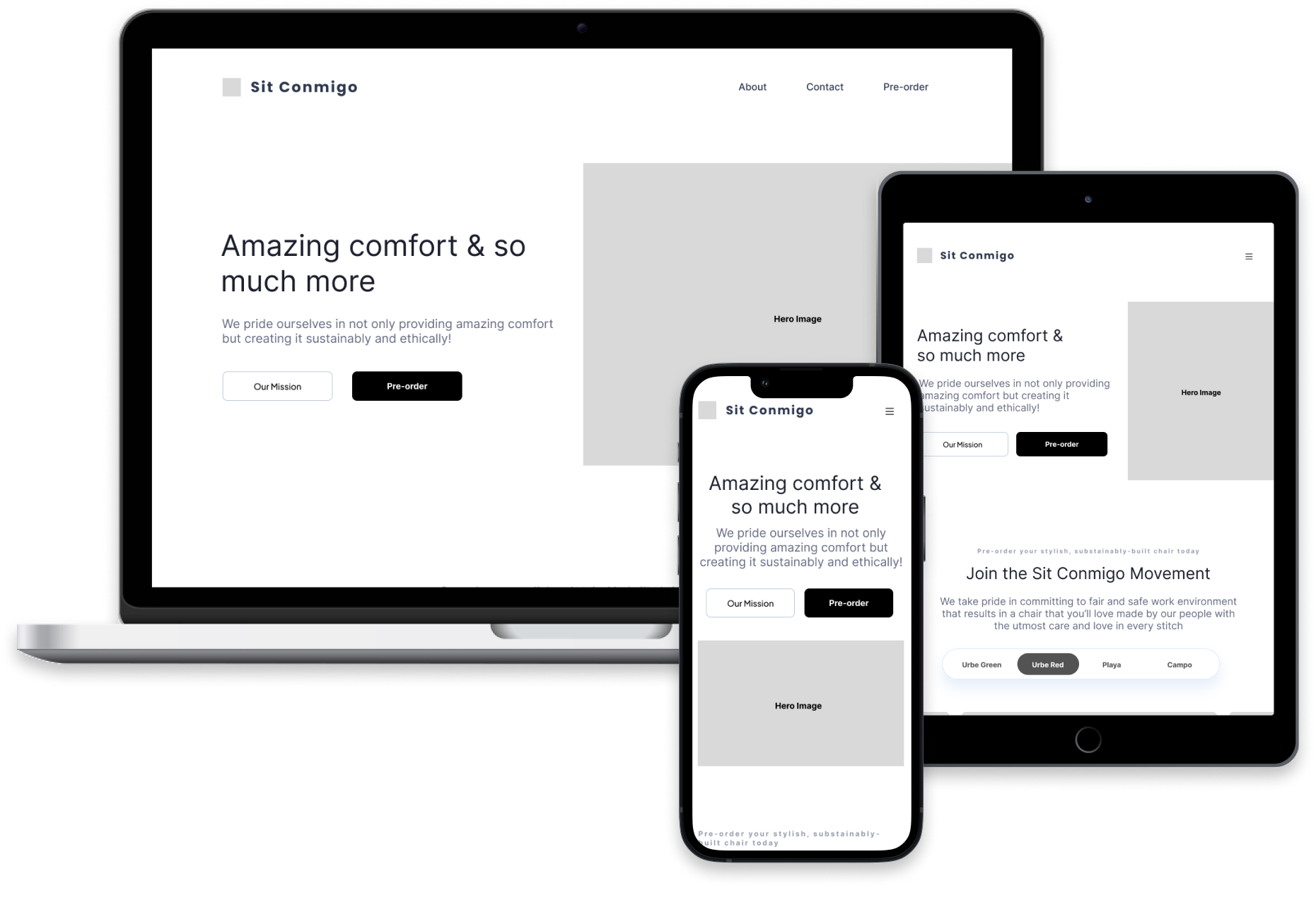
Once I had the final paper wireframe designs I scanned them into the computer and used them as a template when I started to create the digital wireframe in Figma.
I use the Gestalt principle to make sure my design uses similarity, proximity, and common region to create an understandable and user-friendly design.
I used an 8pt grid when aligning and placing the items to make sure they are spaced evenly.
Coordinating colors and fonts
Design System
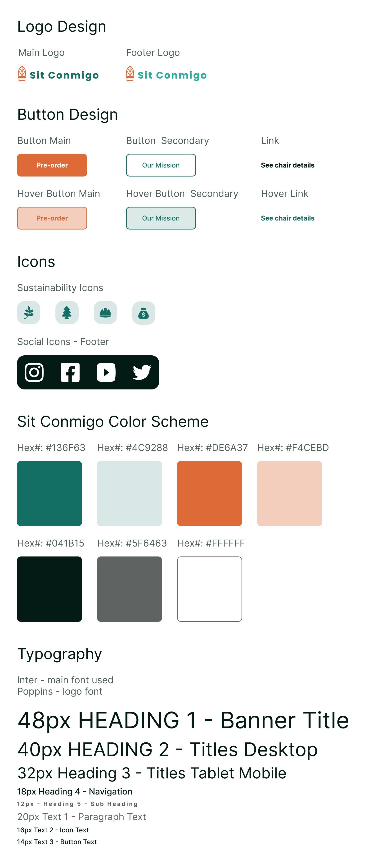
The client has a logo already that they would like to use for the website but the colors of the company are not established yet. The color scheme and fonts were left up to me to design.
In order to find the colors that would work best for the company I looked at the colors of the chairs so I could find colors that complement the products the company is creating.
Once I came up with the colors I made sure to check them for accessibility with WCAG to make sure they would not only work together but also as text and buttons on the website.
Finalizing the design
High-Fidelity Prototype
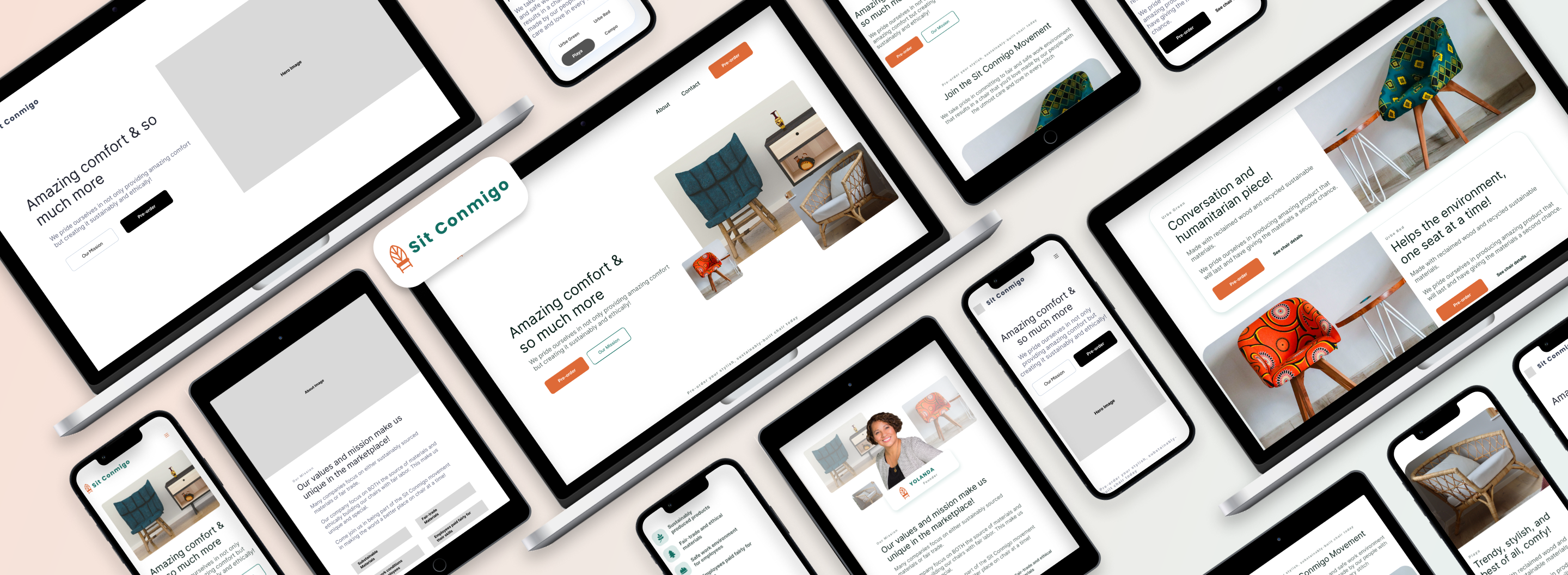
Once I added all the images and design elements to the prototype the design was in its final stage making sure all the client's needs were met.
The goal of the prototype is to have a design that can be tested with users before taking it to the developers so all of the issues are worked out before they start coding the site.
View Figma Prototype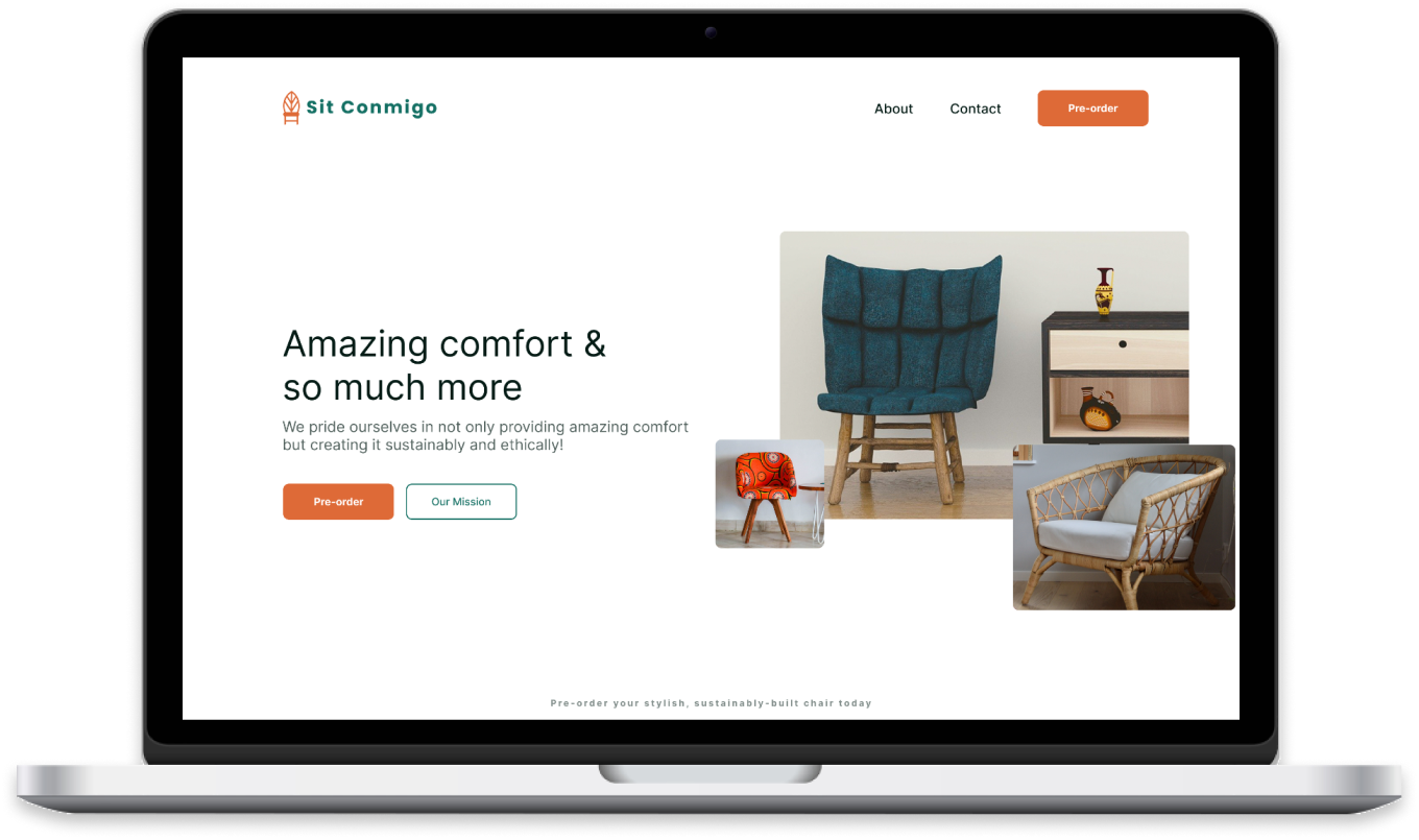
Mobile-first approach
Responsive Design
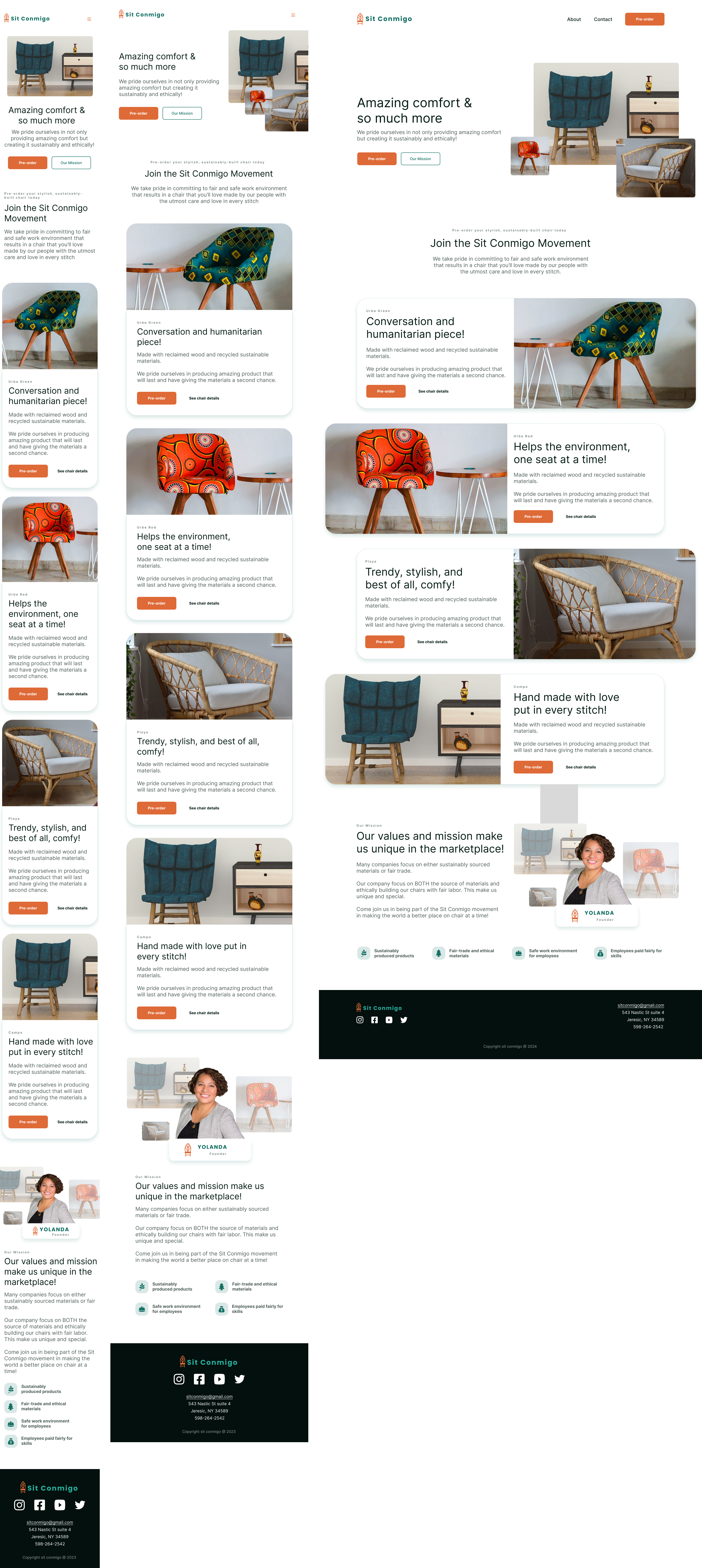
I started with mobile-first design because the clients goal is to get as many customers as possible to view her chairs. I wanted to make sure I started with the device that most users are going to see the website on to make sure all of the important information is easy to find and accessible for users.
Once I had the layout of the mobile design I moved on to the tablet and desktop designs. With each device I thought about how to best arrange the information to create a user-friendly design that helps the user and meets the clients goals.

Learning from the users
Usability Testing
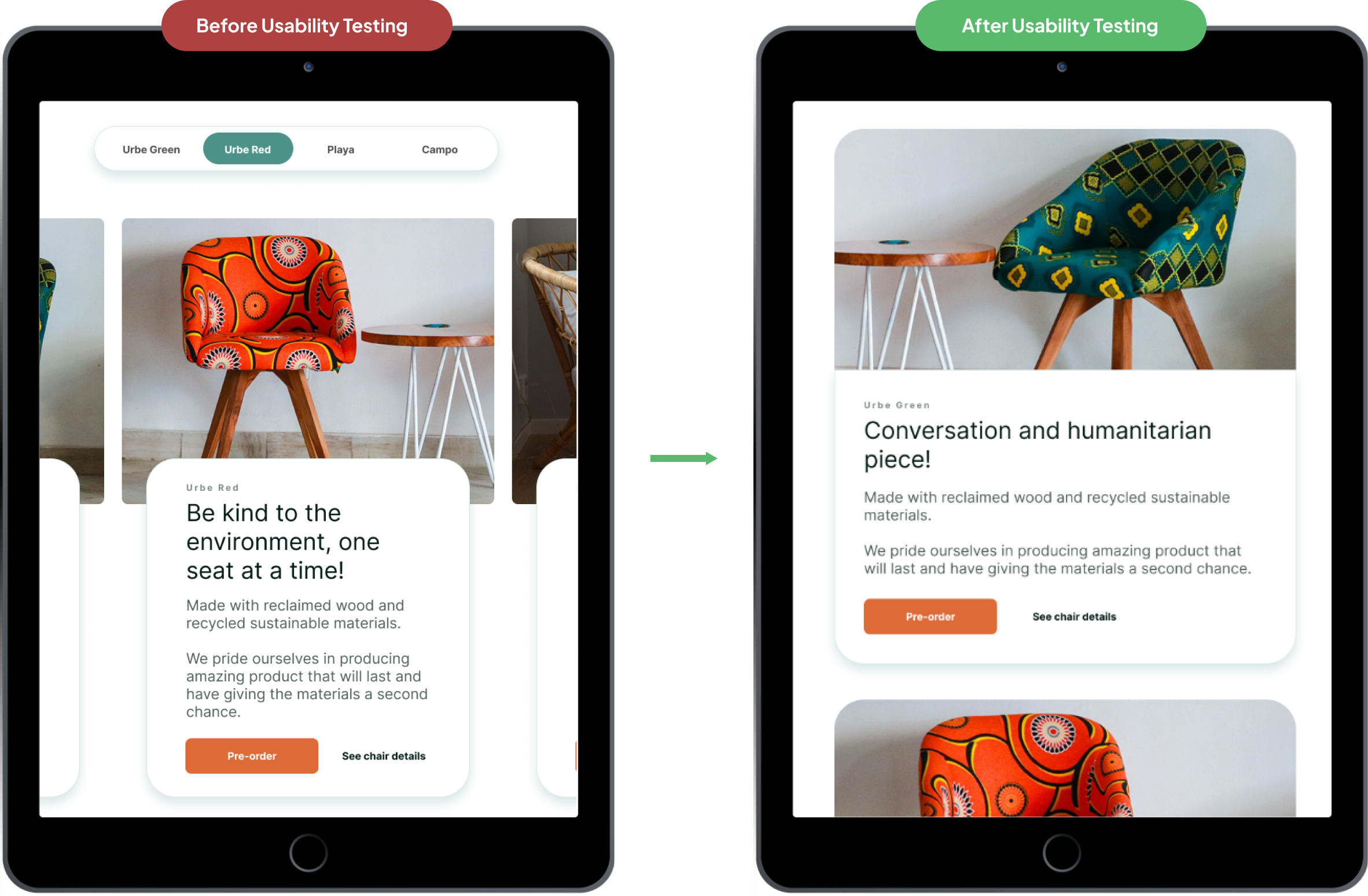
During the usability test I received feedback and noticed that users are not automatically scrolling to see all of the chairs. I created the carousel to save space and make it so the user does not have to scroll down as much.
I conducted research about carousels effectiveness for users I decided to change the design. I thought about the scope of the project and how Yolanda’s goal is to get as many customers to see her chairs as possible.
Carousel design
Iterations
I changed the design and conducted another usability study and found users looked at all of the products with the new design. The usability test taught me that even though I thought the carousel design was efficient it was not the best design for the client and her goal of finding customers to buy her chairs. The main goal is to always create a design that is best for the user and the client and that is what helped drive my design changes.

Client wrap up
Next Steps
I go through the checklist of the clients requests I made from the client interview I conducted at the beginning of the project.
I wrote down next steps for the client about the project. I suggested creating a cart screen that goes along with the design of the site for when users are ready to purchase her chairs. I also suggested -creating an app where users can login and create favorites so that when the chairs become available or new chairs are added they are notified.
Check all are included in final design
Client Brief Complete
-
 A large header (CTA) with images and text encouraging
customers to pre-order
-
 A Pre-order section with chair photos, product names, and
links to pre-order
-
 About section with information on the company and its
mission including a photo
-
 Contact section in the footer with links to social media,
email address, and phone number
-
 Navigation with links to the Pre-order, About, and Contact
sections
Learned From This Project
Takeaways
This project taught me the importance of usability studies and keeping an opened mind about the finding from the study about the design. When I created the carousel I thought it was a great idea until I conducted the usability study. During this process of testing I put my personal feelings about the design I created aside and focused on being objective and making sure to design for the client and users needs.
Thank You!
Thank you so much for your time going through this project with me. I had so much fun creating and learning from this project. I am so excited for the next project to continue to grow as a designer.
